Devlog: weeks 13 and 14
Last week my cat passed away. She was young. It was sudden and completely without warning. A heavy blow that really knocked me off track.
This week I slowly got back to work, but it’s still hard.
Right now I’m struggling with the interface - trying to come up with something based on the Reddit poll results, take everything into account, make it look good, and not die from overload in the process:
(Scribbles are basically some of the thoughts you'll read below)
Yesterday my brain literally stalled. I just wanted to crawl into a dark corner and sit there for three days. I’m not a designer, and this is genuinely HARD for me. I opened and closed the file several times, unable to even think about what to do next.
Still, by morning I managed to sketch and tweak a couple more elements:

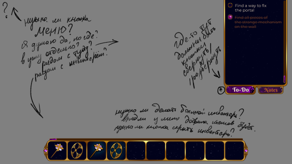
So, what do I have so far:
- There are buttons to collapse/expand notes and tasks. In all three states the window looks fine. I’m slightly unsure about placing it at the top, though - I’ll have to see how it feels in-game
- There are buttons to collapse/expand the inventory, but I’m not entirely sure they’re even necessary. It’s not certain there will be that many items to justify a large inventory window, and I’m not sure it needs to collapse at all - especially since I don’t quite understand how to represent it in a collapsed state. A header-style button like the other elements just doesn’t look right here
- There are scroll bars for notes and inventory
- I need to somehow squeeze in user notes - maybe a third tab in the window? A separate window? And what do I even call it so it doesn’t get confused with auto-notes?
- I also need to figure out hints. No idea yet how or where to place them. Next to the menu feels weird (and probably would lead to misclicks), at the bottom on either side it kind of breaks the balance. Ugh. I’d also like to avoid just a simple “Hint” button with another note-like window. Ideally, the pendulum would hang there and open some kind of interactive window. But that’s still a very abstract idea in my head. Maybe I should just make a simple version first and only then try to invent something fancy (if it’s even needed)
Part of me really wants to just make one unified UI block at the bottom with all of the elements there, but I’m afraid it would end up feeling too much like Nancy Drew, and I’d rather avoid that.
That’s it for now. I rarely bring up donations, and today happens to be one of those days: if you’re able to toss a little something toward development, I’d be very grateful. The vet bills have significantly thinned out my already modest reserves.
Stay healthy and take care of your loved ones.
See you next week.
See you next week.
devlog
dreamwalker
ux/ui
