
IELTS Academic Writing Task 1: Real Exams (August)

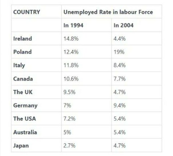
The table above shows the percentage of people unemployed in the total labour work force across 9 countries in 1994 and 2004.
Summarise the information by selecting and reporting the main features, and make comparisons where relevant.
=====

The table shows the production of milk annually in four countries in 1990, 2000 and 2010.
Summarise the information by selecting and reporting the main features, and make comparisons where relevant.
=====

The graphs below show the total percentage of films released in 1996 and 2000 in a certain European country, and the proportion of ticket sales.
Summarise the information by selecting and reporting the main features, and make comparisons where relevant.
=====
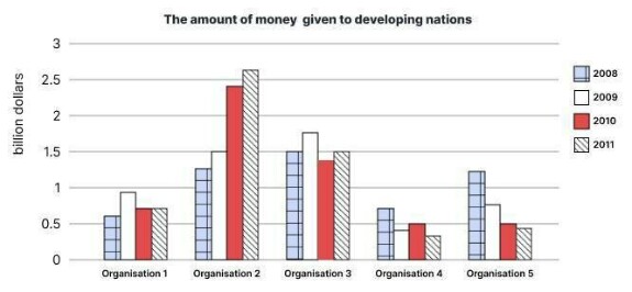
The chart below shows the amount of money given to developing countries from five organisation from 2008 to 2011.
Summarise the information by selecting and reporting the main features, and make comparisons where relevant.
=====
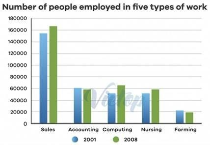
The chart above gives the number of people employed in five types of work in a certain region in Australia in 2001 and 2008.
Summarise the information by selecting and reporting the main features, and make comparisons where relevant.
=====
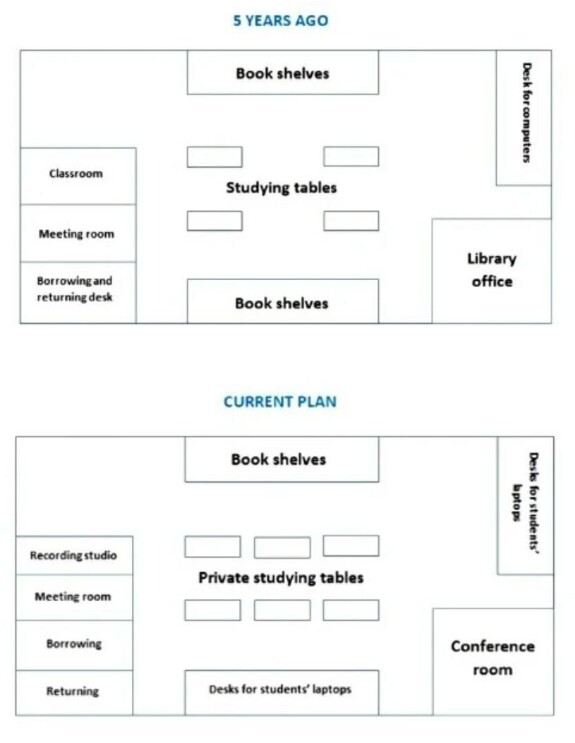
The diagrams show how the layout of a school library changed.
Summarise the information by selecting and reporting the main features, and make comparisons where relevant.
=====

=====
=====
=====
======

=====
=====
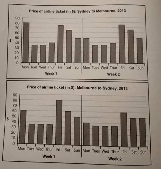
The charts below give information about the price of tickets on one airline between Sydney and Melbourne, over a two-week period in 2013. Summarise the information by selecting and reporting the main features, and make comparisons where relevant.
=====
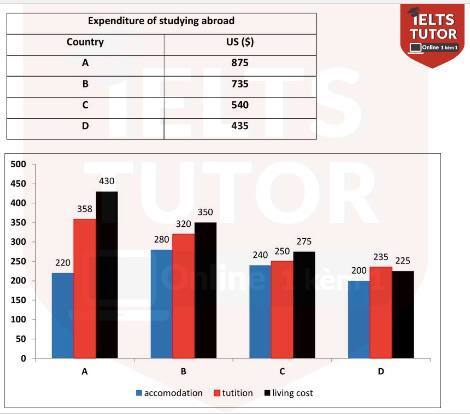
The table and the chart below provide a breakdown of the total expenditure and the average amount of money spent by students per week while studying abroad in 4 countries.
=====

=====
=====
=====

writing task 1
academic