
IELTS Academic Writing Task 1: Real Exams (September)
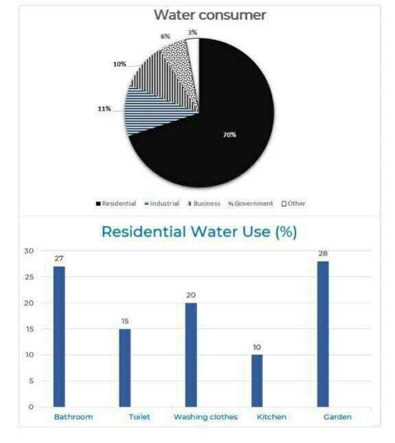
The pie and bar charts below show the percentage of water consumption and use in
Australia in 2004.
Summarise the information by selecting and reporting the main features, and make comparisons where relevant.
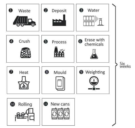
The diagram above shows the recycling process of aluminium cans.
Summarise the information by selecting and reporting the main features, and make comparisons where relevant.
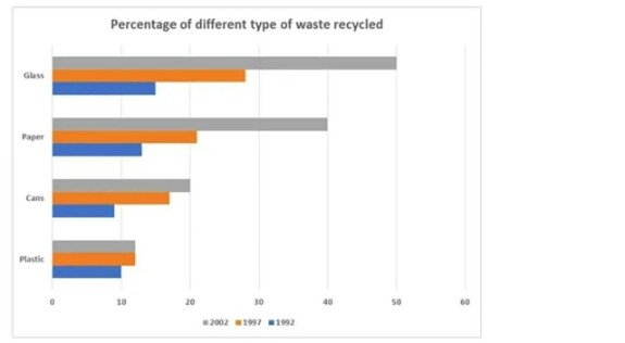
The bar chart compares the recycling rates of four different kinds of waste material in a city, from 1992 to 2002. Percentage of different type of waste recycled.
Summarise the information by selecting and reporting the main features, and make comparison where relevant.
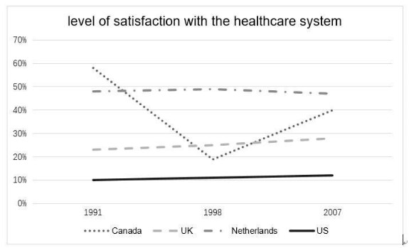
The line graph shows the level of satisfaction of health care system in four countries in three years.
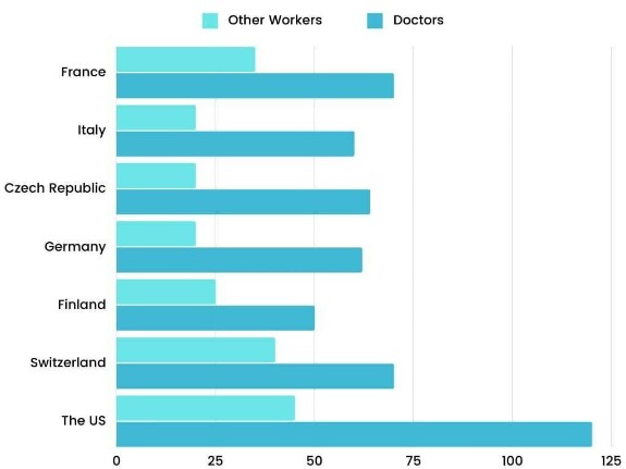
The chart above gives information about the average annual pay of doctors and other workers in seven different countries in 2004.
Summarise the information by selecting and reporting the main features, and make comparison where relevant.
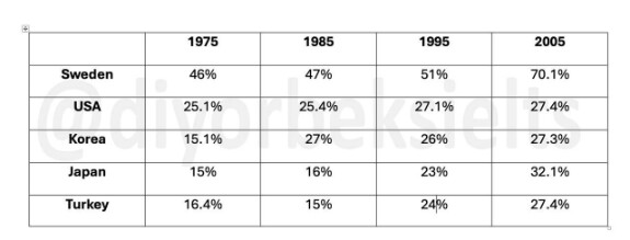
The table above gives information about the amount of tax collected (as % of GDP) in five countries for 4 years between 1975 and 2005.
Summarise the information by selecting and reporting the main features, and make comparison where relevant.
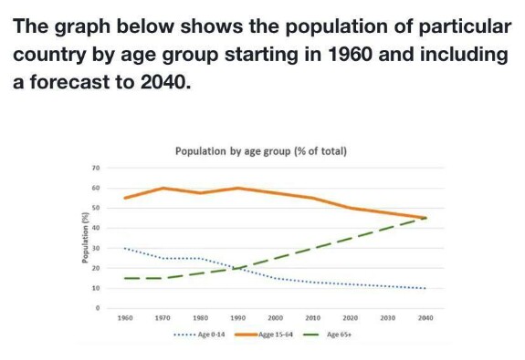
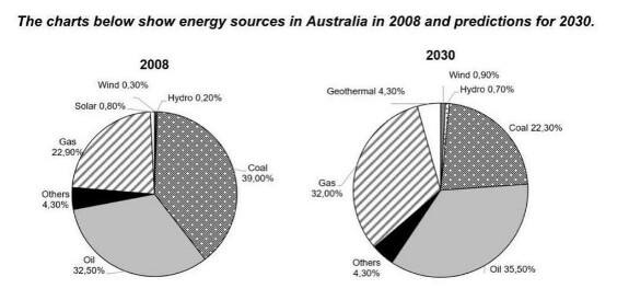

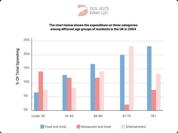
⠀
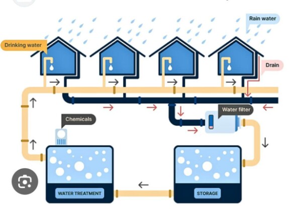
The picture shows the process of collecting rainwater to be then used as drinking water in an Australian town.

The line graph shows the number of kilometers traveled per car in five countries between 1990 and 2010.
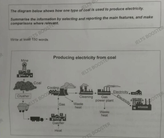
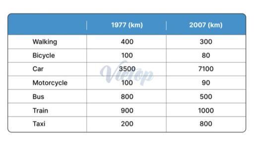
The table below gives information about the average annual distance travelled by adults and the types of travel in 1977 and 2007.
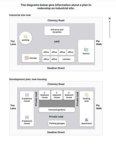
==========
Другие посты для тренировки написания заданий Writing Task 1 модуля Academic и General в общей подборке по ссылке или по хэштегу Writing task 1
Другие посты для тренировки написания заданий Writing Task 1 модуля Academic и General в общей подборке по ссылке или по хэштегу Writing task 1
writing task 1