God Of War Ragnarök - Myths of Midgard KEY ARTS
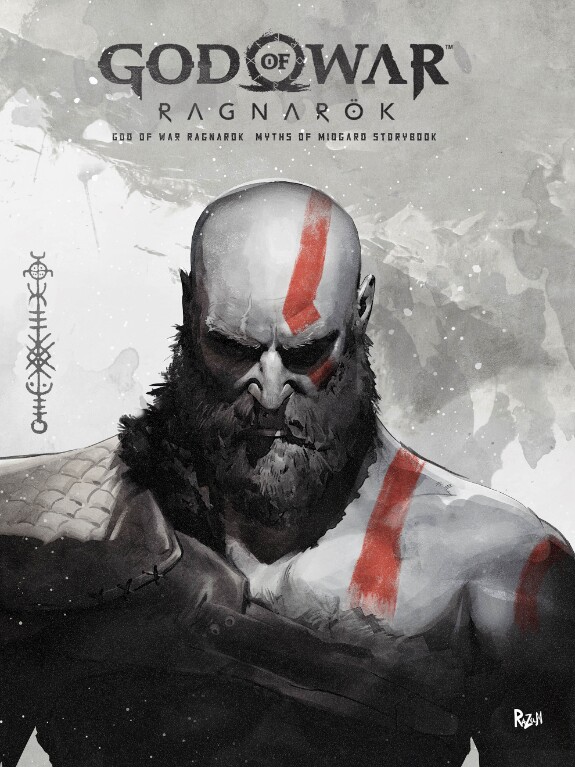
Project Name: God Of War Ragnarök - Myths of Midgard
AD: Eric del Greco
AD: Eric del Greco
FINAL VIDEO: https://youtu.be/ZjucT-UZzgg
So finally I had time and I was given permission to post the arts that I did for the God Of War Ragnarök - Myths of Midgard project.
So finally I had time and I was given permission to post the arts that I did for the God Of War Ragnarök - Myths of Midgard project.
Yes, it was one of the most exciting and at the same time captivating projects in my life. I was incredibly interested in immersing myself in the atmosphere of one of the most interesting game projects in history.
Let me share with you the process of working on key art. A project of this level was not easy, since many approvals and edits took place in the acceptance of my art. The most difficult thing was to find a style and offer interesting ideas for transitions.
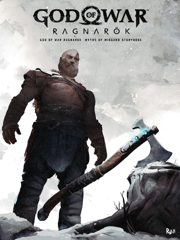
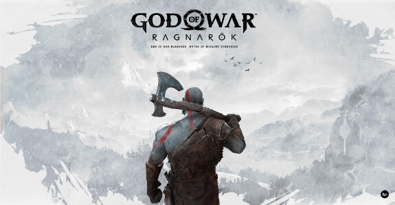
The project was shown at an international exhibition in 2022, and this project was positioned as an opening commercial for the release of the God of War game for Sony.
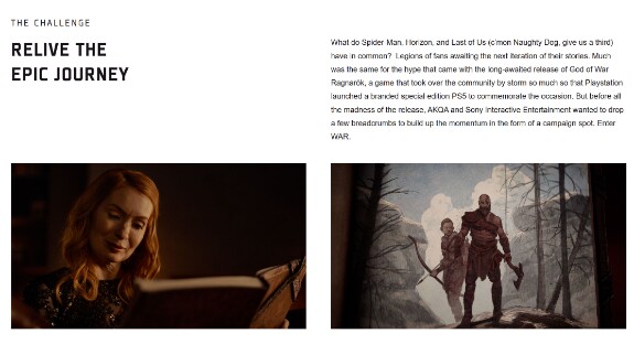
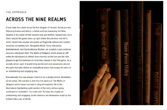
The main task was to develop key arts and also develop a style for presenting animations, offer ideas for transitions and, of course, draw the final illustrations for the project.
The work was carried out in a team, with other artists, so the customer receives several options for ideas and illustrations, which are selected by a special team from Sony.
It was an exciting journey.
It was an exciting journey.
There wasn't much time for the project, so I took Nomad Sculpt/ Procreate and rushed to work. The first thing I did was launch God of War and immerse myself in the atmosphere of the game again.
Then I began to study the mythology and lore of the game, it was a ton of information, but it was interesting to study.
Then I began to study the mythology and lore of the game, it was a ton of information, but it was interesting to study.
My first sketches were very dark, I wanted to create a gloomy atmosphere, since the main character lost his wife, so using the play of light and transitions from darkness to light was an interesting solution that the art director liked, but the main team from Sony requested lighter tones, so this idea was eventually abandoned. Yes, when you work on a large project, a lot of art can be rejected, you need to be prepared for this.
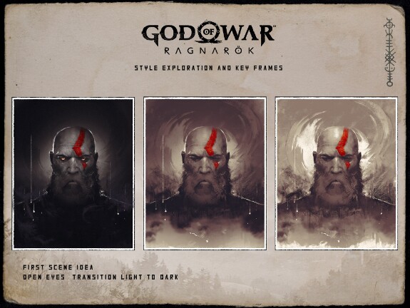
Then the art director ask me to create some quick storyboards.
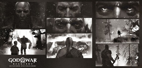
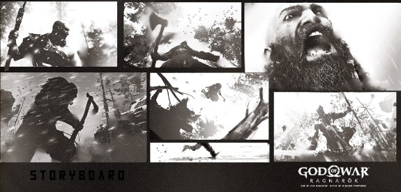
But it was too difficult to implement, you need to understand that each project has a budget and many things are simply impossible to implement, especially in such a short time. Therefore, you always need to find a balance.
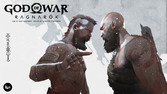
By the way, here are experiments with styles and presentation, as well as color ideas. It look like Manga style I think, that's why I remade it :)
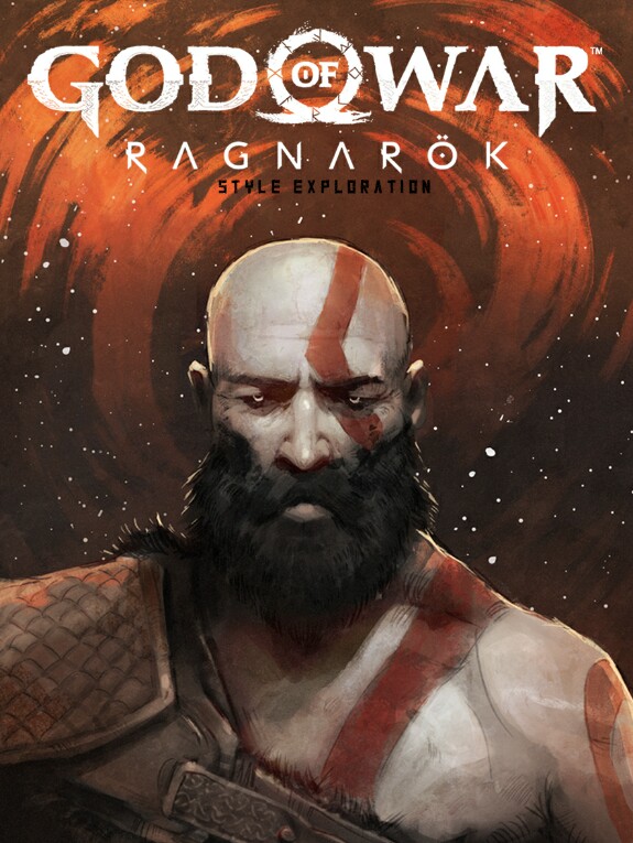
You may ask how I used Nomad and Procreate? It's simple. I loaded the basic models into Nomad and put them in the frames I needed.
Here some screen from Nomad Sculpt: Then I use overpaint to get paint look.
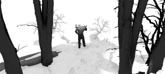
It was easier and faster for me to do this in Nomad than to sit down at the computer, load the blender and waste a lot of time.
Yes, of course, the quality of rendering in Nomad is inferior to Blender, but when it comes to illustration, it is easier and faster for you to use Nomad Sculpt and Procreate to work on the idea and composition in the frame, but ofcourse it is better to finish the final processing in Photoshop.
It is also important not to forget that the customer receives your source files and the file must be professionally designed.
Therefore, an important piece of advice is to keep layers with logical names, avoid a set of unnecessary and strange layers.
Therefore, an important piece of advice is to keep layers with logical names, avoid a set of unnecessary and strange layers.
Organize layers in order and give them logical names, since the customer can transfer your sketch and illustration to animators and it will be difficult for them to understand your source files, keep this in mind!
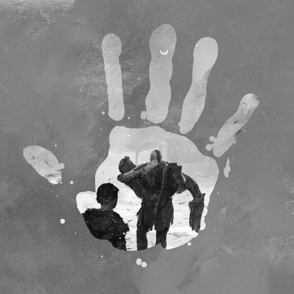
While working on art, various ideas for transitions in animation arise. Like my idea with the handprint, which made it into the final video.
Yes, here are closer pictures with a dark theme.
Yes, here are closer pictures with a dark theme.
Here are closer pictures with a dark theme.
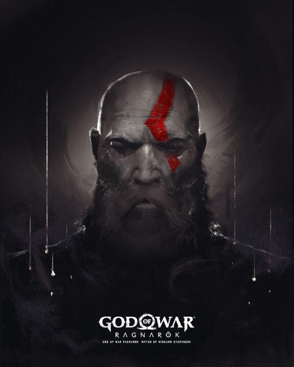
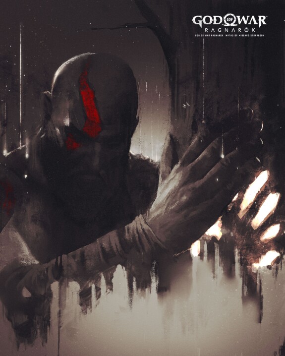
For example, you could make a cool transition from the eyes to the darkness. There were a lot of ideas and it's cool
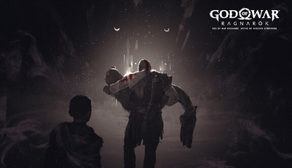
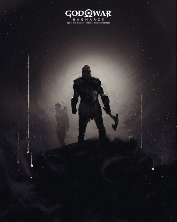
Which I like more, since here you can interestingly play with transitions and it looks very mysterious.
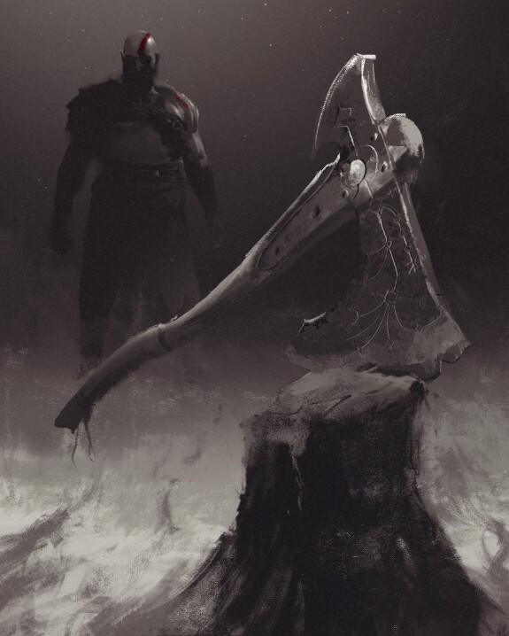
Some quick video concept:
What do you think about this? Let me know in the comments.
Kristian Kivisalo
Huge respect and gongratulations! I worked as AD for the last 10 years of my 25 in the industry and did kinda similar things. I know how exiting it is to design the whole shebang for a cool client, of course utilizing 3D. I didn't do any AAA games but, for example, huge tankers and cranes and so much other stuff. Seeing your stuff on TV or any supermarket in the country, for me it never gets old. But anyway, gongrats, your career is flying upwards! Looks REALLY good what you did.
Jun 07 2025 18:03 (changed)

1
RaZuM
Kristian Kivisalo, thank you! 🙌🤝 glad to hear that!
Jun 07 2025 19:23
